
STANLEY, THE SHINING, AND TYPEWRITERS
If you've ever wondered why all movie scripts look typewritten, there's a method to the madness (sometimes) in Hollywood.

Ever hear that the only dumb question is the one you didn’t ask? Well, this is THAT question. I’ll answer in advance to spare you from raising your hand.
Why do movie scripts always look like they were written on a typewriter?
This is because it is the common formatting accepted as “industry standard” by our industry. With few exceptions and minimal variation, the typewriter-style font, Courier, is the font from which ALL scripts flow.
This harks back to scribes tapping out plays for the Silver Screen on actual typewriters whilst working from actual Hollywood bungalows on real studio backlots. Hence, a format developed. A font stuck. And became the gold standard by which all screenplays are penned. Because why ruin a good thing? Hollywood would never…
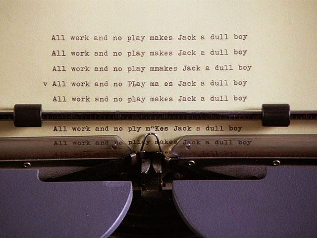
I have seen Stanley Kubrick’s original scripts for The Shining and 2001: A Space Odyssey in a retrospective of his work. Curiously, they have words on their cover pages that were typed and then clearly XXXXXX’d out with actual capital X’s typed over them. Evidence of Stanley changing his mind, exposing an error, or laying bare his own fallibility — before even reaching FADE IN.

Stanley didn’t erase. He didn’t white out. He typed. And then typed some more. Preferring, like his main character, portrayed by Jack Nicholson (and authored by Stephen King), to tap out prose on keys that clicked and clacked, relying on a finite, kinetic roll of inked ribbon. The art of writing was then and remains now a tactile thing. Typing on a typewriter, pressing mechanized keys that slap a metal finger against a piece of parchment imparts a kind of permanence that the evanescence of software cannot.
The typewriter font — Courier — is an attempt to capture the bygone, to bottle the romance, to pay homage to the Tinseltown scribes of ‘yore who gave it all to the page so it would sing on the stage. Courier harks back to the ritual and regimen of the picture trade that is still alive today. And lends credence to the holistic commitment of the craft. Because… “Writing,” as Hemingway once said, “is easy. You just open a vein and bleed.”
Pragmatically, Courier makes the bloodletting uniform to scan, facile to read, and imparts the imprimatur of professionalism. It’s a standard of decorum. A practice of prudence. And it’s useful: Courier is a SERIF FONT. Like the one you are reading now. There is a subtle continuity created by the style of the font along the bottom and top of each letter so it fashions a line that the eye can track. Newspapers, books and periodicals follow this serif font rule to reduce eye strain, minimize fatigue and to promote ease of reading. So do screenplays. Of which Hollywood consumes a vast number.
SANS SERIF fonts are good for titles, chapter and section headings, and short-form edicts, which make them stand out on the page and apart from a body text.
LIKE THIS
Apple's Steve Jobs himself was a proponent of proper font use after learning calligraphy in 1972 from a monk. It is then he learned “the importance of white space and the subtle art of serif and sans serif." Fonts are “subtle art…” so spake a denter of Universes.
As for scripts, their user-friendly design goes beyond the font as there are standard screenplay formatting rules to which one must also adhere. These are commonly known and widely available. All of which serve a purpose as each script is a film “blueprint” that must be read and understood by all layers and levels of the film industry from financiers to foley, from actors to costumes, from art design to direction, from locations to casting.
Given a common format, the importance of what appears on the page transcends design. It’s about voice, story, premise, characters, dialogue, originality, set-pieces, style, structure. The elements that set each play of screen apart. And some head and shoulders above the rest.
While some writers break the rules of font and formatting, it’s rare. And the professionals KNOW which rules they are breaking. As do the professionals reading them. So if you don’t know the rules, if you haven’t adhered to them in the past, then breaking them just telegraphs that you don’t know what you’re doing. Which will be readily apparent to those who have received one too many paper cuts flinging scripts across the room or flipping them toward the circular file.

The point, here, ladies and gentlemen, is to let your CRAFT distinguish you. Not to draw attention to font nor formatting—though one must get that part right—because neither is what separates you from the million-writer pack. What sets you apart is the way you spin your tale, engage the reader, hold their attention, compel them to turn the page.
Don’t use your font to stand out. Use your writing talent. That, with some applied wisdom on fonts, may one day establish you as your own font… of Hollywood wisdom.


If you want some pithy Hollywood percipience garnered from decades in the film biz, check out my book: How To Succeed on Purpose.